Isabel Allende's own website has a page featuring all her covers, at least of English translations. There are a variety of designs, though most of them feature cover art that bleeds to the edges. The design for Paula is the simplest, with prominent text imitating handwriting either side of a very small central image. Daughter of Fortune and Portrait in Sepia have covers more suitable to a classic: subdued, neither too busy nor too colourful.
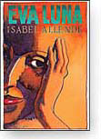 Eva Luna, on the other hand, has a cover dominated by a quasi-modernist painting of a woman's head in close up, in warm but also slightly menacing orange (in which the forehead and background merge), over which the book's title is superimposed in rather clashing green. There seems to be no other text and the overall effect is decidedly garish.
 HarperCollins (via its Spanish-language imprint Rayo) sells the book in Spanish in the US and Canada with an early twentieth-century sepia photograph and a crescent moon set against a dark brown ground and with a prominent recommendation from the Village Voice right alongside the title itself. Allende's name is more prominent than the title, but only marginally so; beneath is the reminder that she is also the author of La casa de los espíritus This cover is simpler and more tasteful, right down to the use of a lower case sans serif font.
 It's Bantam (a mass market division of Random House) that sells the current North American English translation, whose cover depicts a woman writing against a colourful floral background. The type face is more elaborate, reminiscent of art deco, while the artwork itself is fairly interesting: faces lurk in the background; and on the desk at which a woman is writing (though she's looking straight at the viewer) can be found both a sepia photograph of what seems to be an Edwardian woman with parasol, and also a hand grenade. Again, there's something menacing about this cover, especially the woman's somewhat odd gaze, but here perhaps this disconcerting effect is deliberate, rather than accidental.
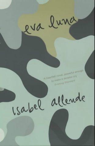 The Penguin (UK) cover picks up on the military theme, but takes it to some extreme: no longer the romantic image or woman's portrait, but an abstract study in camouflage, with a blurb from the Evening Standard placed aslant between title and author's name. I can't but think this is a strange and possibly counter-productive way to sell Allende's work. Maybe the idea is to position her more as an avant-gardist, and to remove all traces of femininity from her image.
 Perhaps this is a tension for her publishers: whether to sell her as Virginia Woolf or as Gabriel García Márquez. Likewise, if on a different axis, there seems to be a tension between positioning her as a modernist, experimental writer or as an author of romances (albeit romances with an exotic and politicized edge). Where exactly does she lie on the scale that leads from Barbara Cartland to James Joyce? The truth is, as in so many other things, she's quite squarely in the middle.
Meanwhile, here is the book in some other languages: Dutch, Czech, and Italian. The Dutch have gone for a fairly plain cover, with a childlike drawing; the Czechs have decided that sultriness is what will sell the story for them. It's not clear what exactly the Italians were thinking.


Again, Allende's own website has a page dedicated to covers of translations in a still wider range of languages, from Turkish to Japanese.
No comments:
Post a Comment